


.png?width=319&height=267&name=gtmetrix_2023%20(1).png)

Having a website is not enough; it must be functional, aesthetically appealing, and adaptive. By adaptive, I mean a website that looks and functions optimally on all devices, from desktops to tablets and mobile phones.
How is this achieved? Through responsive web design. Today, you will discover what it is and how you can achieve this with the help of an all-in-one theme.
What is Responsive Web Design?
Responsive web design, also known as responsive design, is a technique that allows a website's content to adapt to the screen size of the device being used.
Whether a user is browsing from a desktop computer, a tablet, or a smartphone, the website automatically adjusts to provide the best possible experience.
This web design technique is not only essential for providing an excellent user experience, but it's also beneficial from an SEO standpoint.
Advantages of Responsive Web Design
Responsive web design comes with numerous benefits.
Firstly, it improves the user experience, as visitors can navigate and use your website with ease regardless of the device they are using.
Secondly, it is efficient in terms of time and cost because you don't need to develop and maintain different versions of a page for different devices; you only need one responsive web design.
Lastly, it enhances your SEO, as Google favors responsive websites due to their better user experience.
Why is Adaptive Design Important?
Adaptive web design is essential for several reasons. Let me share the most important ones.
Enhanced User Experience
This type of design ensures that website visitors have an optimal user experience, regardless of the device they are using.
This means they won't have to deal with horizontal scrolling, small font size, or constant zooming in and out to interact with your website.
Wider Reach
By having a design that adapts to multiple devices, you are expanding your reach to potential customers or readers.
More and more people are using mobile devices to access the web, so having an adaptive design means your site will be accessible and functional to a broader audience.
Improved SEO
Google and other search engines favor responsive websites because they offer a better user experience and have a single URL for each page, making it easier for search engines to index and crawl the site's content.
Therefore, adaptive design can help improve your site's ranking in search results.
Simpler Maintenance
Instead of having to design and maintain separate versions of your site for different devices (as in the "mobile-first" design approach), responsive web design allows you to have a single design that works on all devices.
This can significantly reduce the time and resources needed for site maintenance.
Now, let's see how this can be combined with an all-in-one theme.
What is an All-in-One Theme?
An all-in-one theme is a website design template that provides a wide range of features and customization options in a single package.
These themes usually offer predefined layouts for different types of pages (such as homepages, blogs, online stores, etc.), as well as a variety of design and style options you can apply to your site.
Additionally, they may include built-in features such as e-commerce support, SEO optimization, social media integration, and more.
Advantages of an All-in-One Theme
All-in-one themes offer many benefits, and here are the main ones:
- Ease of Use: You can build a complete website with a cohesive look without needing programming or design skills.
- Versatility: They often come with a variety of predefined designs and customization options that you can apply to create the website you want.
- Cost-Effectiveness: By including a wide range of features in a single package, they can be more cost-effective than purchasing multiple plugins or hiring developers to implement similar features.
- Support and Updates: All-in-one themes are often developed and maintained by dedicated teams, which means you can expect regular support and updates to keep your site up to date and secure.
How to Choose the Right All-in-One Theme
Selecting the right theme is crucial because it can impact the functionality, appearance, and effectiveness of your online presence. Here are some factors to consider and recommendations to help you in this process.
Speed
Some all-in-one themes can be heavy due to all the features and functionalities they include.
My recommendation is to choose one that is optimized for speed to ensure fast loading times and keep your visitors engaged.
Remember that users are not willing to wait more than 3-4 seconds for a page to load, so pay attention to this aspect.
Compatibility
Make sure it is compatible with all major browsers and devices. It should also work well with the plugins and tools you plan to use on your site.
Think long-term, as while you might only need something basic initially, you might require more features later on, so find out if the theme offers scalability. It's very important!
Design
Choose a theme with a design that aligns with your brand and is attractive to your target audience.
You should also look for one that offers customization options so you can tailor it to your specific needs.
Updates
Themes that are regularly updated are more secure and less likely to have compatibility issues with future updates of the platform you're using.
Examples of All-in-One Themes
I know the market is vast, so I'll focus on giving you 2 examples (HubSpot and WordPress) of the best all-in-one themes to help you make the right decision:
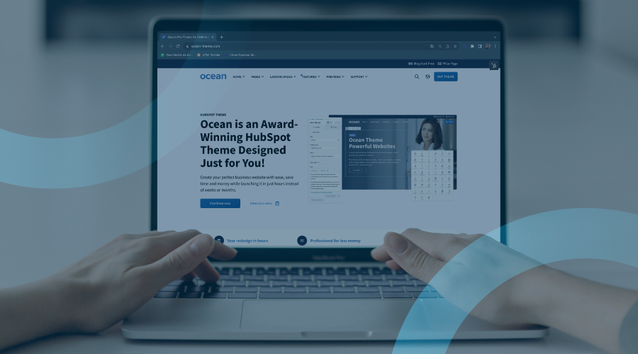
Ocean Pro Theme (HubSpot)
Ocean Pro Theme for HubSpot is an excellent example, as it provides an attractive design and a range of features and functionalities, giving users everything they need to create a complete and customized website within this CMS.
Among its benefits are:
- Responsive design
- Easy customization of typography, colors, layouts, and more
- Built-in features like contact forms, blogs, SEO, social media integration, and more
Avada Theme (WordPress)
Avada is one of the most popular themes for WordPress.
It offers a plethora of design options and built-in functionalities, such as sliders, contact forms, social media widgets, and more.
Moreover, it comes with an intuitive page builder that makes customizing your site's design easy.
Steps to Create an Adaptive Web Design with an All-in-One Theme
Now let's get to the most important part: the steps to achieve adaptive web design with an all-in-one theme, which is one of the easiest and most effective paths to achieve good results with your website.
Step 1: Define Your Goals
The first step for any web design project is to clearly define your needs and goals:
What functionalities do you need for your site? Who is your target audience, and what kind of user experience do you want to provide?
Having clear objectives will help you search for a theme that aligns with them.
Step 2: Theme Selection
Next, to create adaptive web design, you need to choose an all-in-one theme.
In this case, we recommend Ocean Pro Theme, as it is versatile, 100% customizable, lightweight, and perfect for any type of website.

Ocean Pro comes with multiple homepage demos and internal templates, allowing you to choose the one that suits your needs best and then customize it to your liking.
The best thing about Ocean Pro is that all its demos and templates are fully responsive, ensuring your website will look and work well on all devices.
Step 3: Theme Installation
Once you have purchased or downloaded your theme, you need to install it on your website.
This process will vary depending on the platform you're using, but it generally involves uploading the theme file to your site and then activating it.
Step 4: Theme Customization
After selecting the theme, it's time to customize it.
Ocean Pro comes with a variety of options for you to tweak it to your liking, allowing you to modify typography, colors, background images, and more.

Moreover, you don't need coding knowledge to customize this theme, as it comes with a drag-and-drop builder that makes customization simple.
Just place the elements where you want them and adjust them to your liking.
Step 5: Check Adaptability
Once you've finished customizing your site, it's time to check its adaptability.
Make sure to test it on various devices and screen sizes to see how it behaves; all of this can be done using the preview feature provided by this theme.
While doing so, verify that all elements of your site display correctly and that navigation remains intuitive and easy to use on all devices.
If you encounter any issues, you can go back to customization and make the necessary adjustments.
Ocean Pro: Your Ally for Creating the Best Adaptive Website
Adaptive web design has many advantages, such as:
- Reduced costs by not requiring code or requiring less of it, hence not needing experts.
- Simple maintenance due to the use of templates.
- Enhanced experience by adapting seamlessly to any device.
All of this and more is possible with Ocean Pro, and the best part is that you don't need to know any code at all, and you can customize it 100%, depending on your brand's requirements.
You can have a functional and appealing website in as little as 30 days! If you don't believe us, contact us to learn more about this option that could be the best for you.
Conclusion
Adaptive web design is essential in today's digital age. With the all-in-one theme Ocean Pro, creating a website with these features has never been easier.
Not only is it easy to use, but it also comes with a multitude of customization options, ensuring that your website will stand out and look great on all devices. So, what are you waiting for? Start creating your adaptive website today!