


.png?width=319&height=267&name=gtmetrix_2023%20(1).png)

Having a website with responsive design is increasingly important, as the number of people accessing the internet via mobile devices continues to rise. According to Statista, there are over 7.3 billion mobile users worldwide.
As a result, as a company or entrepreneur, it is essential to opt for designing a website suitable for desktop browsers and any other device.
If you want to know what features your responsive web pages should have, I'm here to tell you so that you can take action!
1. Adaptability

A responsive website helps avoid duplicate content by using the same version for different environments, with the content adapted to each device's characteristics.
This is achieved through the use of design techniques that allow web elements to dynamically adjust based on the device being used, providing a consistent and appealing user experience.
Furthermore, by avoiding duplication, your site's technical SEO is enhanced, as it won't incur penalties from Google's algorithm.
A responsive system must adapt and, in specific cases, prefer a vertical format. You can use website templates that respect the site's characteristics based on the format, effectively adjusting when the user rotates their device.
2. Element Prioritization
A good responsive design must prioritize elements, meaning it shows the most relevant ones first.
When accessing a website through a desktop browser, we usually see the overall page content: title, images, text, menu, etc. However, when doing so from a mobile device, the information is displayed differently due to the more compact format.
Therefore, it's crucial to prioritize content and position it so that the most important aspects are visible at the beginning, with the rest gradually revealed.
3. Flexibility
This feature of responsive design refers to the ability to adapt to different screen resolutions and orientations on devices.
Likewise, it is important in terms of the menu to opt for a dropdown menu or an icon that, when clicked, reveals the elements for accessing links.
This modification or adaptation aims to save space and optimize, which is crucial for the mobile version.
4. Intuitive Navigation
Navigation is a critical aspect on mobile devices.
Menus should be easy to use, and links and buttons must be large and clear enough for easy tapping on touchscreens.
Furthermore, the website structure needs to be simplified so that users can quickly find what they are looking for.
Otherwise, they are likely to become frustrated and abandon the site, leading to missed business opportunities.
5. Unique Functionalities

Many times, when implementing responsive design, it is taken for granted that mobile devices offer functionality that desktop browsers do not.
For example, when using a smartphone, people can use the camera to have an augmented reality experience, displaying a 3D image of products or providing more information through a QR code.
Similarly, it can be used to access users' location data or activate notifications, engaging them in different ways.
6. Optimization of Loading Speed
Loading speed is a key factor for user retention on a website.
In this regard, responsive design websites are optimized to load quickly on various devices, improving the user experience and contributing to SEO and positioning.
As a reference, the bounce rate for sites on phones is approximately 50%, and loading in less than 5 seconds guarantees up to 70% more viewing sessions.
7. Readable Content

Content readability is crucial in responsive design, especially on mobile devices where space is more limited.
Therefore, it's essential to choose a font that is large and clear enough for users to read without the need for zooming. Additionally, there should be adequate spacing between lines and paragraphs for a good experience, reducing visual fatigue. It's important to carefully manage text length to avoid overwhelming the reader.
Another crucial element is the contrast between text and background, ensuring optimal readability for people with visual impairments, regardless of lighting conditions.
8. Optimized Images
Images and media play a fundamental role in responsive web design.
Therefore, optimizing them for different devices is crucial to ensure fast loading times and a smooth user experience without compromising visual quality.
This involves correctly compressing images and using the appropriate format to reduce file sizes, especially when accessed with a slow connection.
Techniques such as progressive loading or lazy loading can further improve image loading speed.
9. Interactivity

Smartphones and tablets provide the advantage of promoting more direct interaction with people through touch screens.
This needs to be leveraged in responsive design through appropriately sized icons and spaces large enough for finger swiping without accidentally clicking where one does not intend or interrupting the content review.
All of this will help ensure a good experience for your visitors.
10. White Spaces
According to Colin Wright, white spaces act as amplifiers that help readers focus on content.
In responsive design, providing a good reading experience is a priority. Therefore, you must ensure that padding and margins do not blur on smaller screens.
One of the best ways to ensure this is to conduct tests yourself to verify that the amount of white space on your website is sufficient and comfortable.
11. Consistency

When opting for this type of design, it is ideal to maintain a consistent look and feel across all devices. This reinforces brand identity and facilitates navigation for those who are regular visitors.
To achieve this, there are some things to consider, such as a consistent color palette, typography, and design styles across all versions, regardless of screen size or resolution.
This allows you to create a good and unified experience, enhancing brand perception and gaining the trust of your users.
12. Scalability
Scalability is one of the key points because it ensures that a website not only looks good and functions correctly but is also created with flexible and adaptable techniques so that, as trends change, it continues to meet the needs of the digital world.
A good responsive design must be able to adapt to new technologies, such as high-resolution screens or smartphones with much larger screen sizes, without requiring too significant changes.
13. Optimized Forms
Forms are a crucial part of some websites, so they must be designed responsively to ensure they function correctly on any device.
This requires optimizing the layout and design of input fields, buttons, labels, etc., so that they display well regardless of screen size and adapt to touch input.
For example, input fields can automatically expand to show keyboards tailored to touch screens, and submit buttons can be large enough and easy to press on different devices.
Minimizing the number of required fields and simplifying the data entry process is equally important, so don't overlook it if you want to reduce friction and improve conversion.
14. Breakpoints
Breakpoints are the foundation of responsive design. They are vital filters applied to CSS styles for different devices.
They help web designers describe categories of devices and write code that dictates how a website will appear on each one, adjusting styles and layout. For instance, you can program to have 2 columns on the desktop version but only one on mobile devices.
Configuration will largely depend on the type of content present, but it should always be used carefully to avoid errors and ensure everything displays correctly.
15. Cross-Platform Compatibility
Responsive design ensures that the website is compatible with a wide variety of platforms, such as different internet browsers and operating systems.
This means that regardless of where a person accesses from (iOS, Windows, macOS, Firefox, Safari, etc.), the content will display and function properly.
This feature is essential to ensure that the maximum number of users can access the site smoothly. Additionally, it helps build trust in the brand as it demonstrates a commitment to accessibility and user experience.
Furthermore, it can have a positive impact on SEO efforts, as search engines value a site's compatibility with different browsers and devices.
Best Tools for Implementing Responsive Design

There are various software options for building a responsive website, but I'll show you the simplest ones to help you start seeing the benefits of having a site with these features.
1. CMS Hub + Themes
While you can create your pages from scratch with HTML and CSS codes, the reality is that the process can be complex if you are just entering this world.
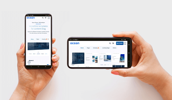
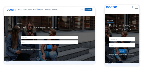
Therefore, the recommendation would be to opt for a website builder, such as HubSpot's CMS, and purchase a theme that offers all the advantages of responsive design. For example, Ocean Theme, designed to adapt to any device and function correctly without the need for coding knowledge.
2. CSS Frameworks
CSS frameworks, like Bootstrap, are powerful tools that allow you to create a responsive web design.
Through them, you can obtain predefined components, grid systems, and styles to use as starting points for your website.
This can help speed up site development and ensures good cross-platform adaptability.
3. CSS Preprocessors
Another option is CSS preprocessors, like Sass, which enable designers and developers to write CSS more efficiently.
This can be a good choice in responsive design projects, where different styles need to be managed based on the device.
Preprocessors simplify their management and facilitate the creation of more flexible style sheets.
Conclusion
Now that you know which features should not be missing in a responsive design, it's time to ensure your site incorporates them, as adaptability is crucial nowadays.
If you need help or guidance to build your site based on these principles, get in touch with us! We can assist you without too much hassle, so you can have a solid digital asset in no time.